10 Reasons Your Website Isn’t Converting Leads (And How to Fix It)
Key Takeaways
Your website might appear fine on the surface but could be silently hemorrhaging leads and revenue if it’s not optimized for conversions. This article uncovers the hidden pitfalls that could be driving visitors away and offers actionable steps to fix them. Here are the key takeaways to keep in mind:
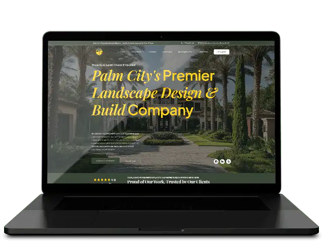
- First impressions are instantaneous: Visitors form an opinion about your website in just 50 milliseconds. Outdated designs, clunky layouts, or unprofessional visuals erode trust instantly and reduce the chances of conversion.
- Speed matters more than you think: A delay as small as one second in page load time cuts conversions by 7%, while also negatively impacting SEO rankings—making fast performance a crucial factor.
- Mobile optimization is a necessity, not a luxury: With over 55% of web traffic originating from smartphones and tablets, failing to provide a seamless mobile experience risks alienating more than half your potential audience.
- Simplified navigation retains visitors: Confusing menus or unstructured layouts frustrate users and lead to bounces, often within seconds.
- Trust signals are non-negotiable: Missing customer reviews, testimonials, or security certifications make users question your credibility and hesitate to engage.
- Clear CTAs guide user action: Poorly phrased or poorly positioned call-to-action buttons leave users uncertain about next steps and result in missed business opportunities.
- Psychological design elements increase engagement: Beyond clean aesthetics, incorporating strategically placed emotional triggers enhances trust and user comfort.
- High bounce rates indicate unmet visitor expectations: Misaligned content between your ads, messaging, and landing pages drives users away before they engage.
- Clutter hurts conversions: Overwhelming designs crammed with pop-ups, ads, or heavy text deter visitors. Streamlined, user-centric layouts keep visitors focused.
- User experience is king: Technical glitches like broken links, awkward scrolling, and sluggish performance can frustrate visitors and result in abandoned opportunities.
Tackling these issues transforms your website from a passive digital placeholder into an active lead-generating machine. In today’s competitive marketplace, optimizing your site isn’t optional—it’s essential. Keep reading for an in-depth exploration of solutions to maximize your website’s conversion potential.
Introduction
What if your website was the silent culprit behind dwindling leads and revenue? The harsh reality is that most visitors form their first impressions within 50 milliseconds. A clunky, slow, or outdated website means potential customers might leave before you even get a chance to make your pitch. And that’s just the tip of the iceberg—weak trust signals, inconsistent branding, confusing navigation, and non-responsive mobile designs exacerbate customer drop-offs.
The good news? These issues are entirely reversible. By identifying and eliminating stumbling blocks, your website can transition from a digital liability to a powerful tool that attracts, engages, and converts visitors into loyal advocates. From implementing faster load speeds to rethinking psychological design elements like trust signals and CTAs, a series of focused changes can radically improve your results.
Let’s dive into the core reasons your website might be turning visitors away—and explore how you can fix them with precision and efficiency.
10 Signs Your Website Is Costing You Customers
1. Poor First Impressions Are Turning Visitors Off
When it comes to websites, first impressions are everything. In a world where users take just 50 milliseconds to form an opinion, you don’t get a second chance. If your site is outdated, inconsistent, or poorly designed, your prospects might leave without exploring further.
Warning signs:
- Dated design that feels like 2008 instead of 2023.
- Broken links or pixelated visuals indicating lack of maintenance.
- Inconsistent branding—think mismatched fonts, colors, or messaging.
Solution:
- Update your site with a modern, sleek interface using intuitive tools like Figma for design or frameworks such as Bootstrap for clean development.
- Regularly audit for broken links, non-functioning elements, or outdated visuals. A consistent color palette and typography reinforce trust in your brand’s professionalism.
2. Slow Loading Speeds Are Dragging You Down
Speed isn’t just a nice-to-have—it’s critical. A mere one-second delay in load time reduces conversions by 7%, while Google prioritizes fast websites for SEO rankings. If your site takes longer than 3 seconds to load, expect high bounce rates and lost opportunities.
Common culprits:
- Overloaded pages with large images and videos that aren’t compressed.
- Outdated or bloated plugins slowing backend performance.
- Low-bandwidth hosting that can’t handle traffic spikes.
Solution:
- Compress heavy images and videos with free tools like TinyPNG or platforms such as Cloudinary.
- Implement lightweight caching plugins like WP Rocket to improve site speed.
- Upgrade to a hosting service optimized for performance, such as Kinsta or WP Engine.
3. Missing Trust Signals Make You Look Unprofessional
Modern consumers are inherently skeptical—but clear trust signals can reassure them that your business is legitimate and reliable. If your website fails to establish credibility, you’re letting potential sales slip through your fingers.
What’s missing:
- No customer testimonials or social proof visible on key pages.
- A generic “Contact Us” page with no transparency around who you are or how to reach you.
- Lack of HTTPS encryption (that little padlock symbol your browser expects).
Solution:
- Feature glowing testimonials, recognizable client logos, or award badges front and center.
- Include complete contact information with a phone number, email, and even a physical address. It adds authenticity.
- Get an SSL certificate—it’s inexpensive and key for earning user trust.
4. Weak CTAs Lead to Visitor Confusion
Your CTA (Call to Action) is your website’s driving force—telling visitors what to do next. Weak or hard-to-find CTAs leave potential buyers stranded or indecisive.
Classic missteps:
- Vague or uninspiring messaging like “Click Here” or “Learn More.”
- Poor placement or color schemes that don’t grab attention.
- No urgency that motivates immediate action.
Solution:
- Create short, action-oriented CTAs like “Download Free Guide” or “Claim Your Spot Today.”
- Use bold and contrasting colors to make CTAs stand out.
- Run A/B tests on CTA copy, design, and placement using tools like Optimizely.
5. Confusing Navigation Sends Visitors Packing
If users can’t find what they’re looking for, they’ll look elsewhere. Clunky menus or overcomplicated layouts can quickly frustrate and alienate visitors.
Red flags:
- Menus with endless drop-downs that confuse users.
- Poorly structured pages without clear hierarchies.
- Lack of an internal search bar for easier content discovery.
Solution:
- Stick to intuitive menus with 5-7 categories max.
- Organize content using clear hierarchies or breadcrumb navigation.
- Integrate a robust, user-friendly search function powered by plugins like SearchWP.
6. Clutter Is Ruining the User Experience
A crowded or overly busy website overwhelms visitors and reduces engagement. Simplicity—with clean layouts and clear focus—wins every time.
Signs of clutter:
- Aggressive pop-ups, sidebars, and interstitial ads.
- Walls of dense, unformatted text.
- Excessive use of bright or mismatched colors that hurt readability.
Solution:
- Eliminate distractions by leaving ample white space.
- Simplify your layout by grouping related content.
- Use subheadings, bullet points, and a minimalist design ethos to keep users focused.
Conclusion
Your website is more than just your online business card; it’s your best salesperson—if optimized correctly. Addressing issues like slow load speeds, weak trust signals, cluttered navigation, and outdated visuals can elevate it to the role of a conversion powerhouse.
The future belongs to businesses that embrace user-first designs and data-backed strategies. By implementing consistent optimizations—refining CTAs, speeding up performance, and using analytics to make informed decisions—you’ll build a website that doesn’t just attract visitors but converts them into customers.
Your website should tell visitors a clear story: This brand is trustworthy, modern, and focused on solving your problems. The question remains: Is your site ready to meet its full potential? If not, the time to act is now. Those 50 milliseconds have never been more valuable.